 Since Brad Holland has written at length in a 2010 blog about his involvement with Playboy, we can do no better than give his account verbatim. Enjoy.
In its prime, Playboy published a regular feature called Ribald Classics. I called them Dirty Fairy Tales, and I cut my teeth in the art business doing monthly pictures for the series. When I started, illustrations were supposed to illustrate. That usually meant visualising a scene from a text. But I wanted to do something different with pictures, and the Ribald Classics gave me the opportunity to try.
In the beginning, the editors at Playboy weren't used to the kind of things I wanted to do. They expected illustrations to fit the stories like a glove. They thought mine fit like an extra hand. In those days, illustrations for Playboy began in the art department. The staff conceived the ideas, did sketches, got editorial approval, then assigned the jobs to illustrators whose styles they thought matched the concepts. At least that’s how the art director explained it to me. I was reckless enough to tell him I’d only do my own ideas. I got a try-out on a double page spread. When I delivered the art, they paid me, published the work with my picture in the magazine, and gave me a green light to start doing the rest of the series my way.
In spite of the smooth take-off, however, the first year was a bumpy one. I had the idea that a picture should reflect the artist’s personality in the same way that a text reflected the author’s. That meant starting from a similar point of view as the author, but not necessarily the same one. Imagine that you’ve locked me in one room, I said, and the writer in another. You give us both the same assignment, then publish the results. You haven’t illustrated the article; you’ve married the art to the text.
It’s an understatement to say that my approach puzzled the editors. Most of them took the conventional view that an artist’s commitment to a text could be judged by how well he channelled the writer’s sensibility instead of his own. Nevertheless they gave me the opportunity to try. The art directors gave me six stories to work on at once; that was half a year’s work.
I liked the idea because first, the money meant I’d be able to buy a bed – at the time I had just moved to New York, was living in a slum apartment on the Lower East Side, and had been sleeping on a pile of towels. Having a bed would be a major step up in my life. But there was another reason I liked the opportunity to work on several pictures at once. It gave me the chance to develop a graphic style to solve a variety of different problems and to see how it would work in those different incarnations. For me, the trick was to see how flexible I could make that style within the limits of the layouts, the nature of the subject matter, and the need for a certain consistency in the look of the pictures from issue to issue.
When I delivered the first six assignments the art directors seemed pleased, but I heard that the editors were grumbling. It seems most of them thought my pictures weren’t proper illustrations. Some writers felt the same. One famous author said my pictures made him feel as if he had been slapped between the eyes with a wet fish. Not a bad idea, I thought when I heard that. Where could I get a wet fish?
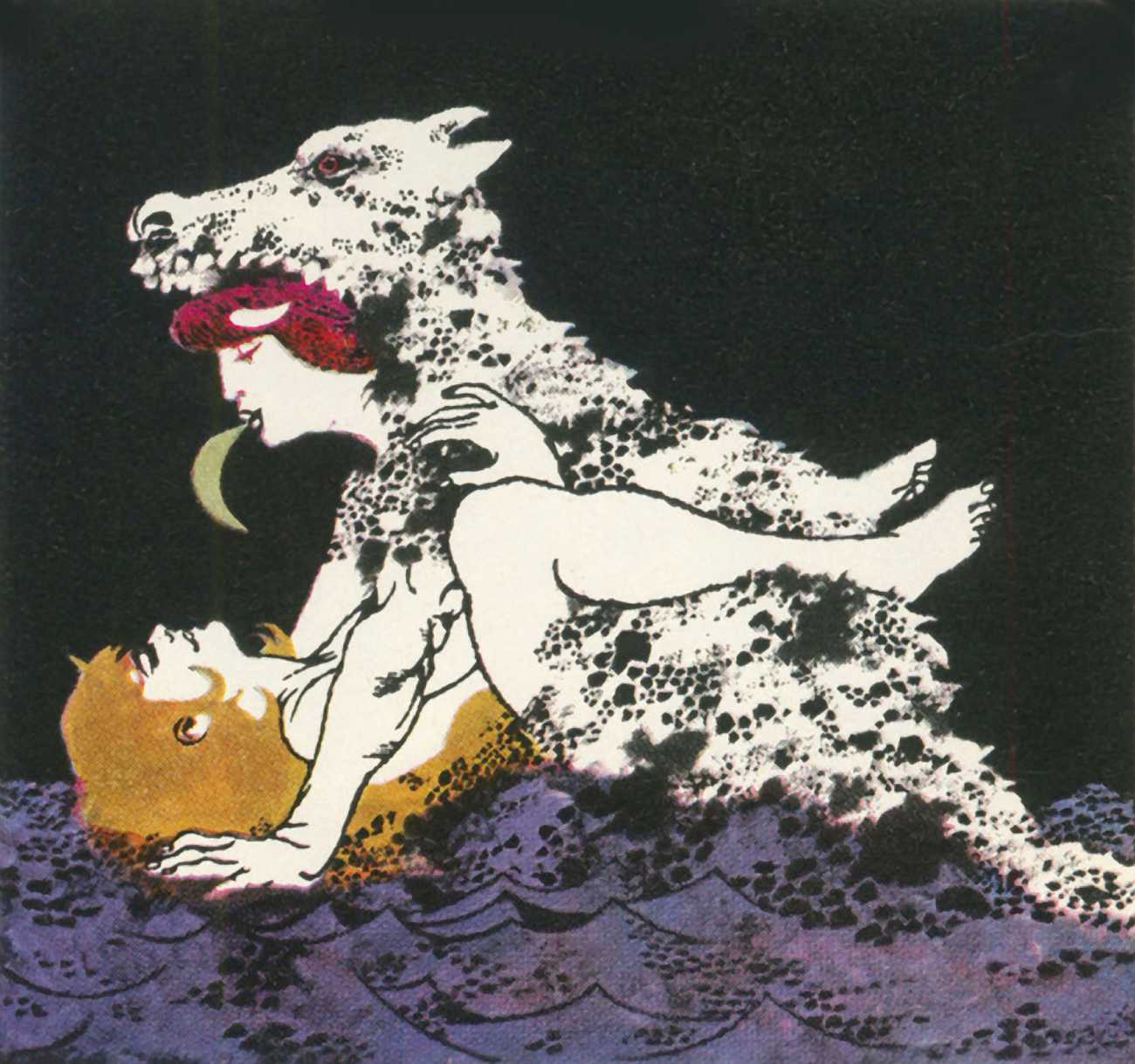
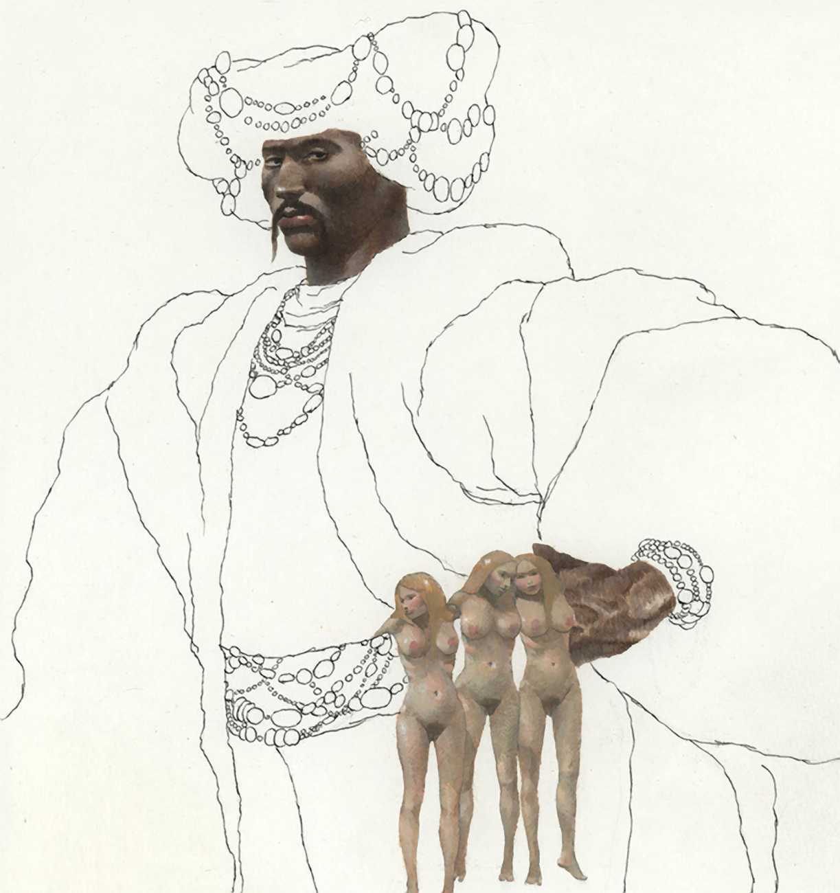
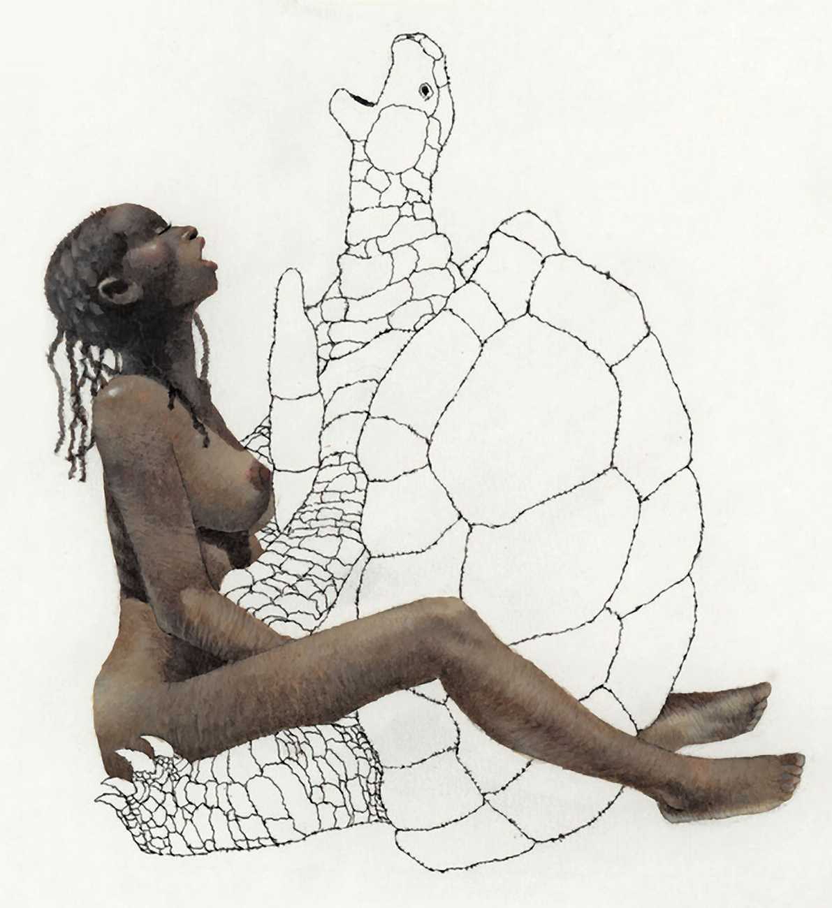
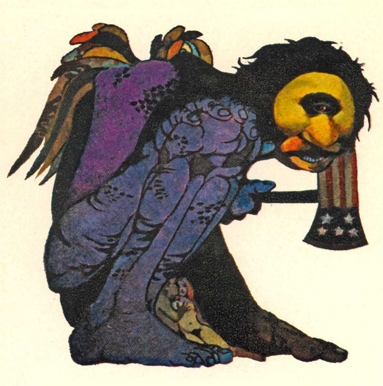
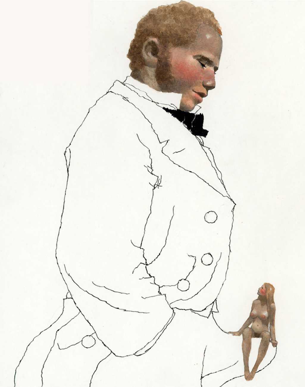
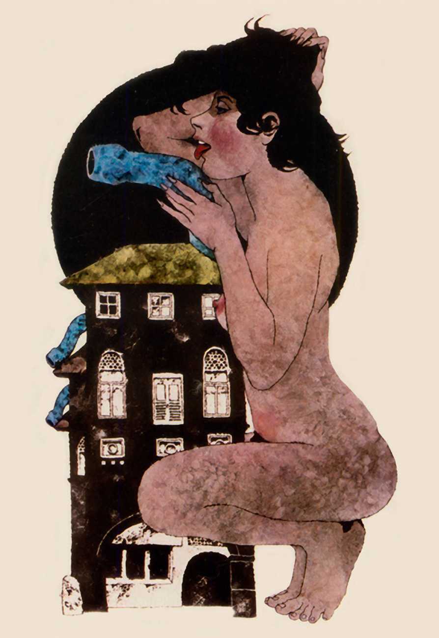
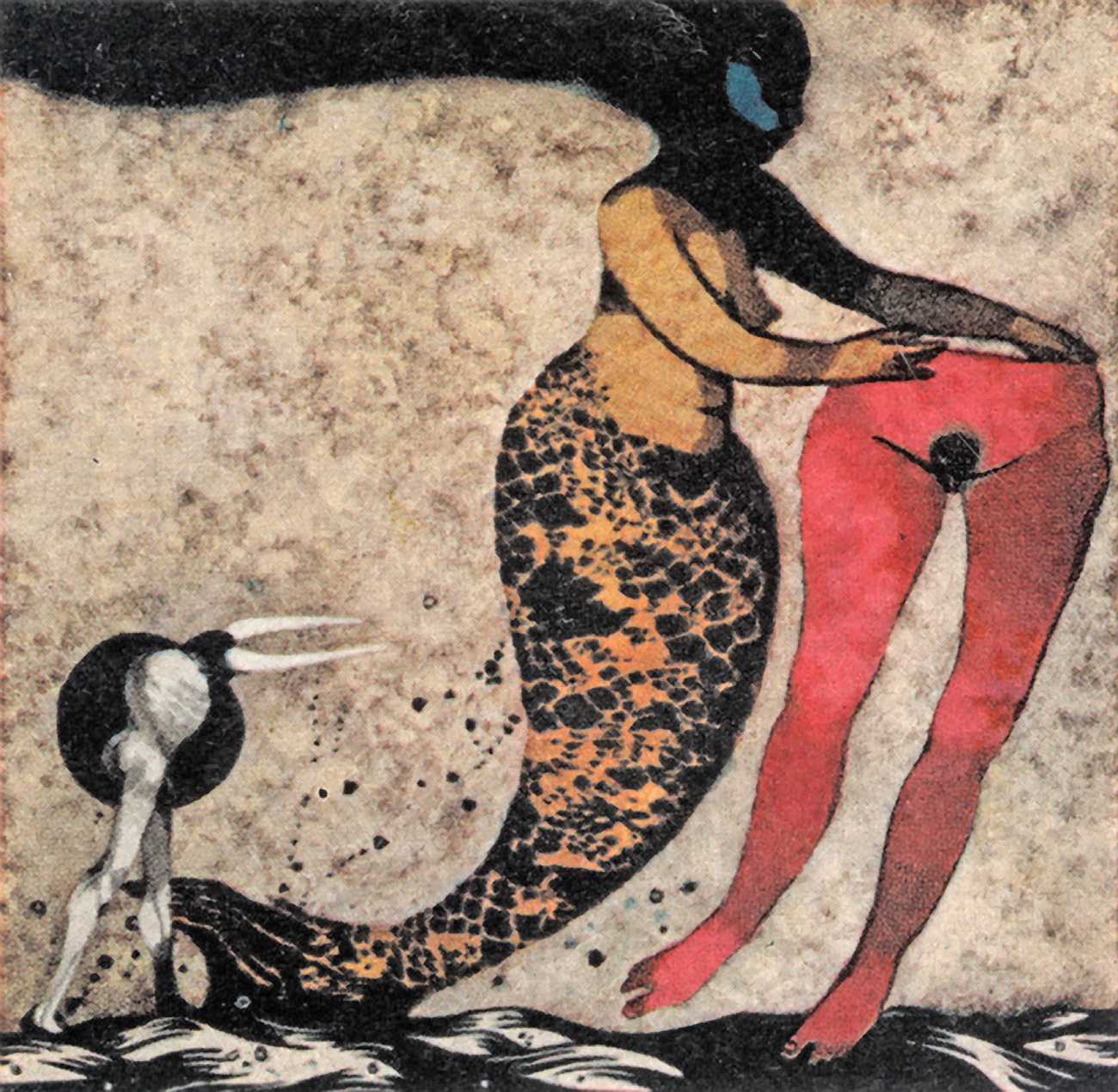
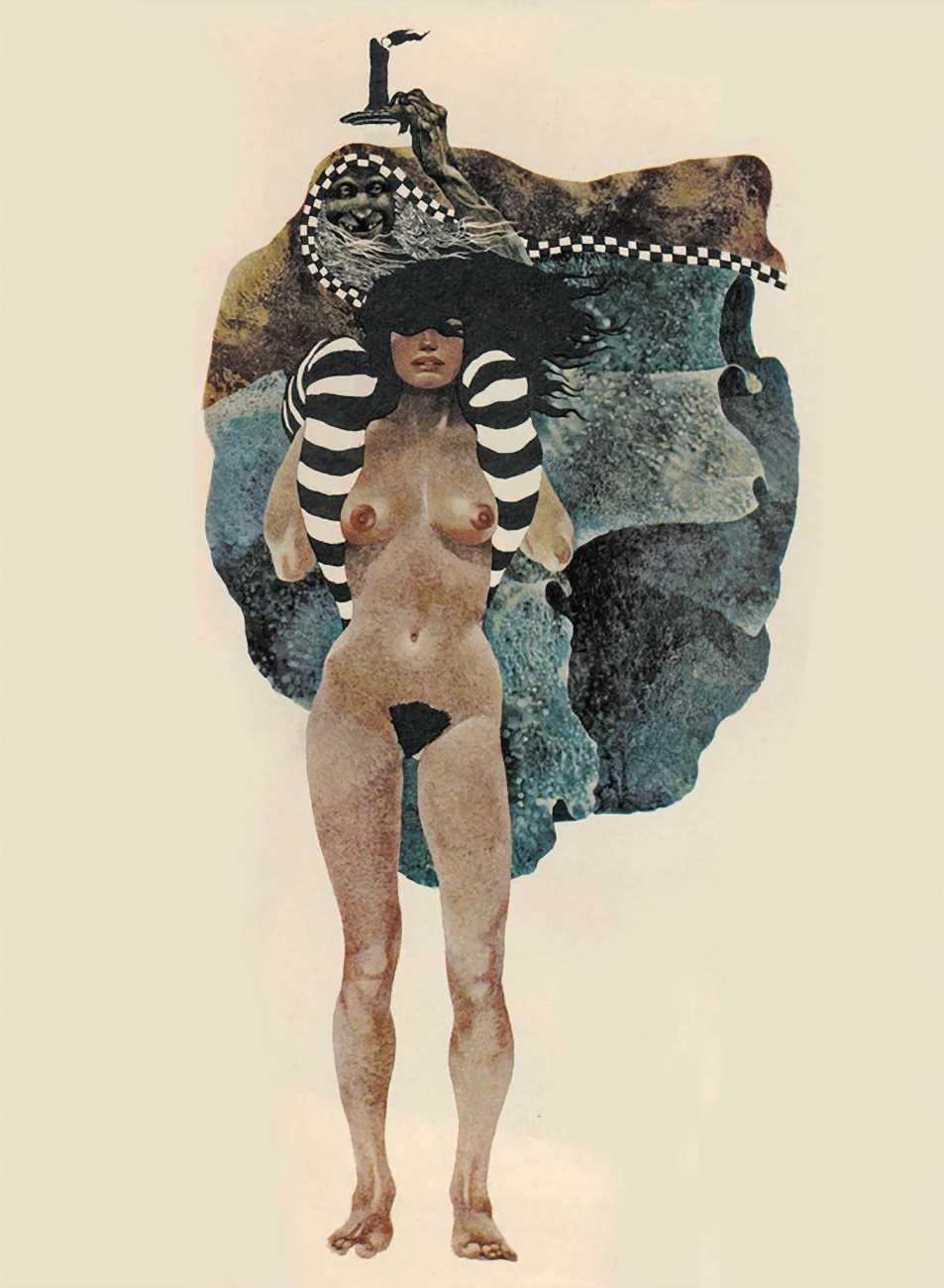
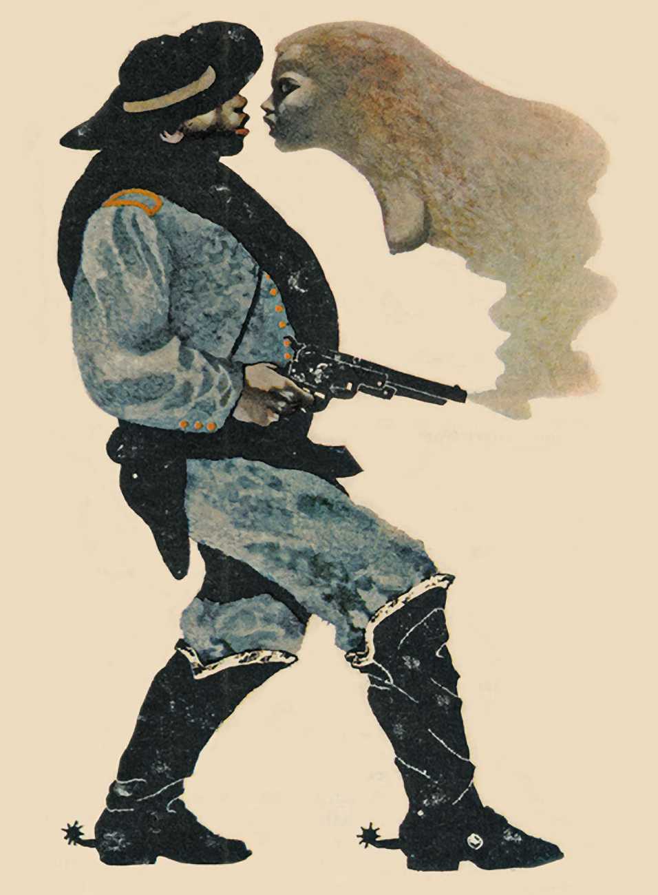
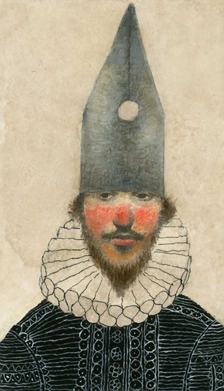
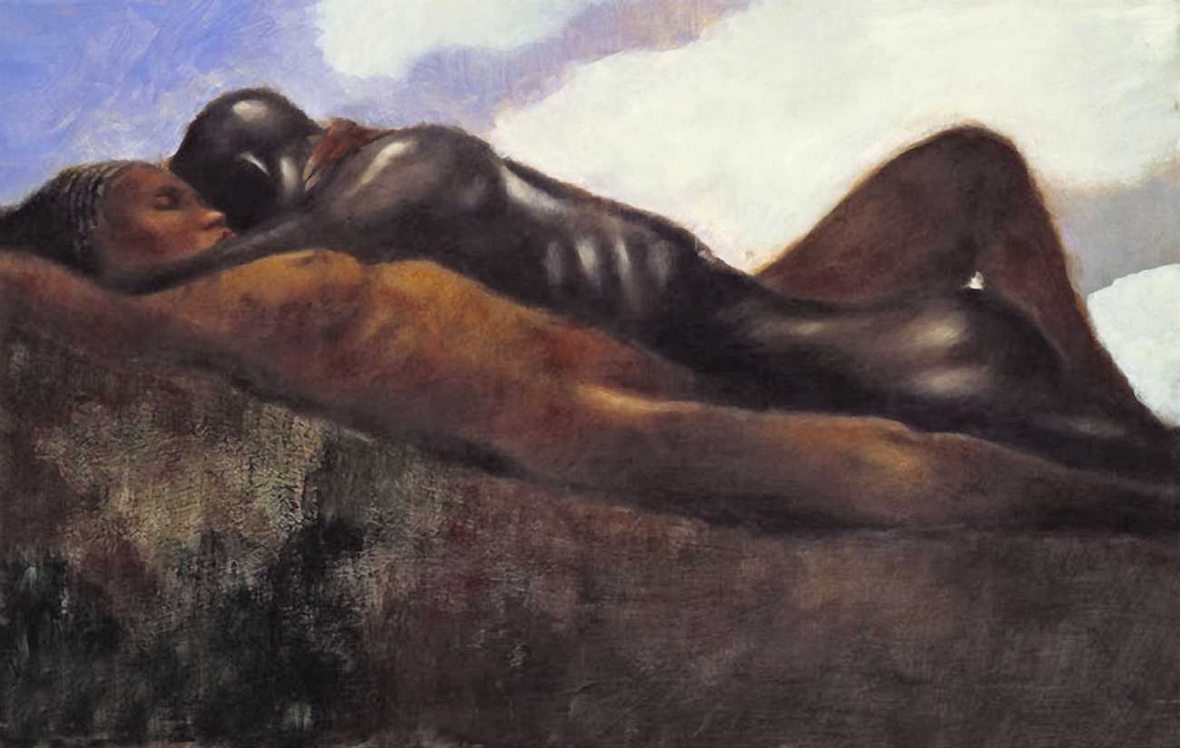
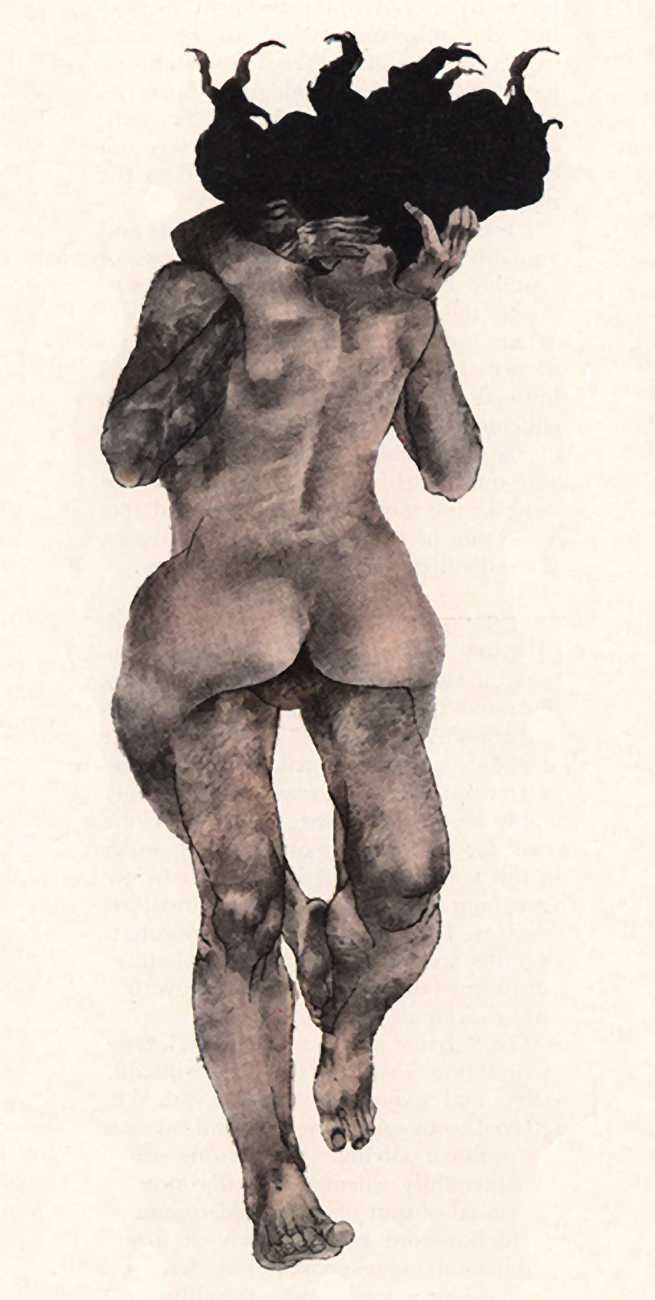
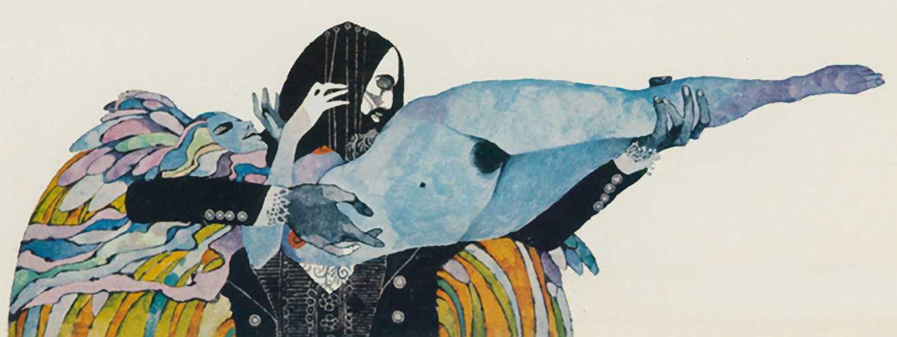
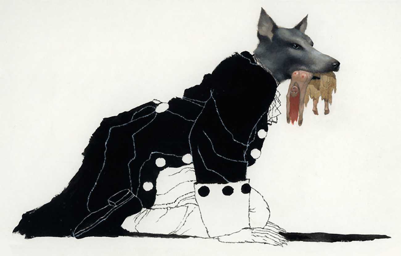
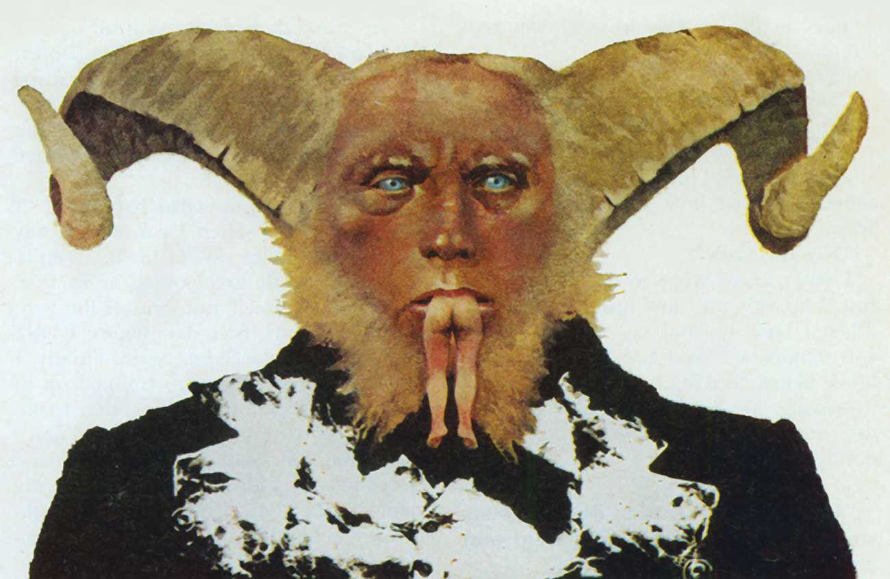
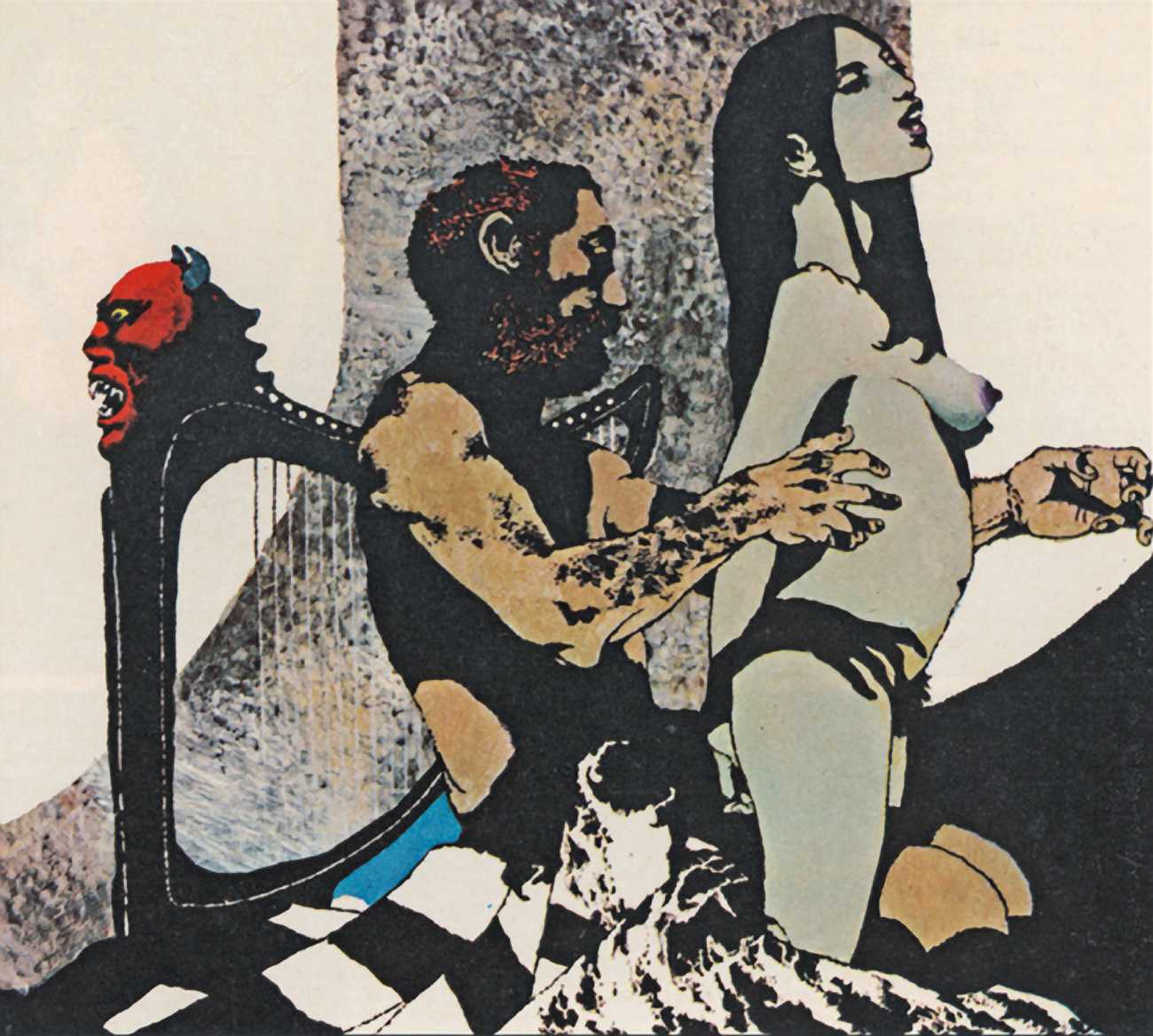
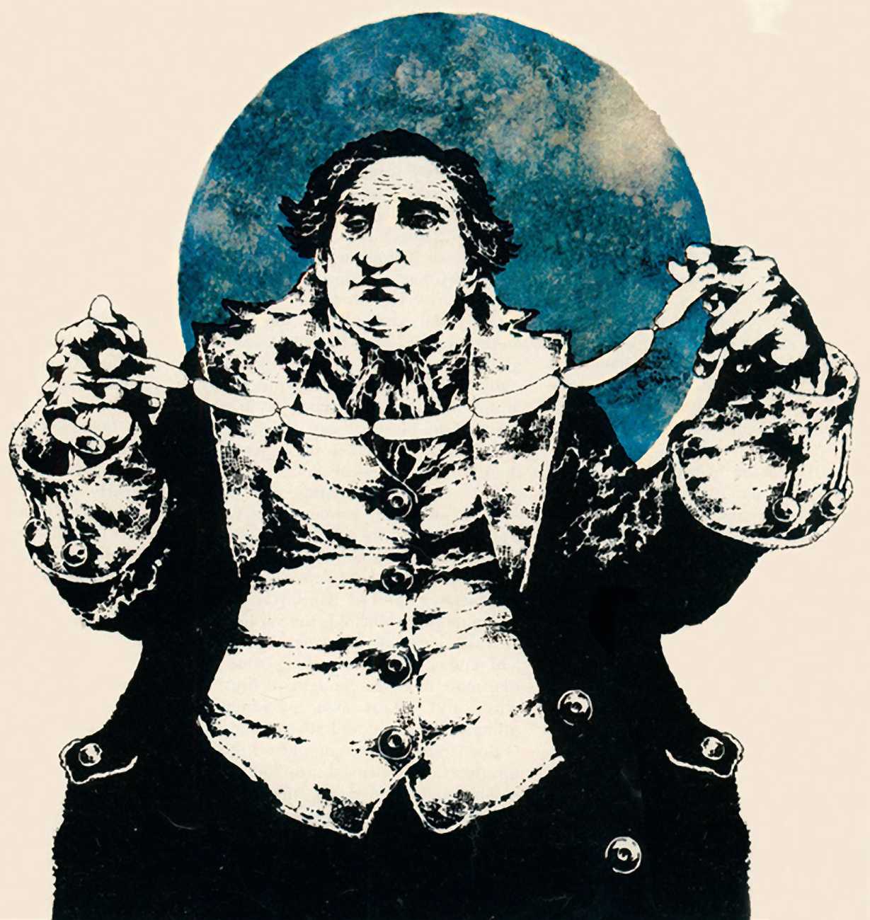
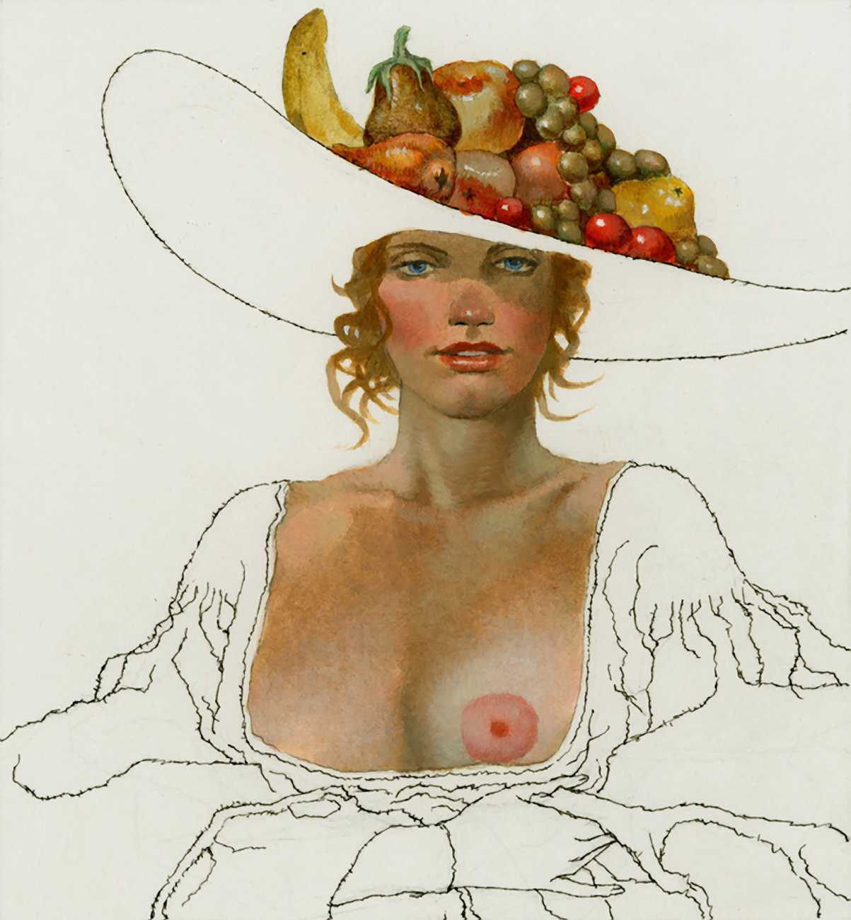
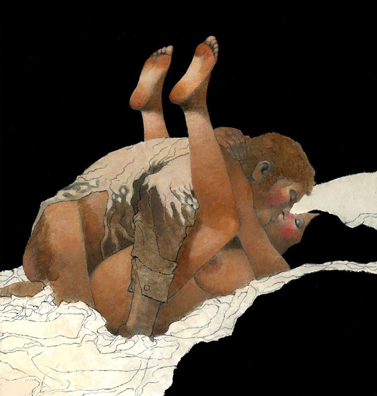
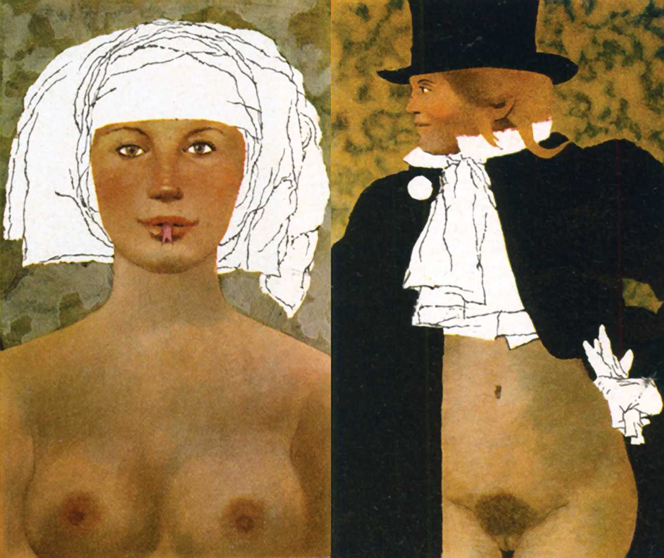
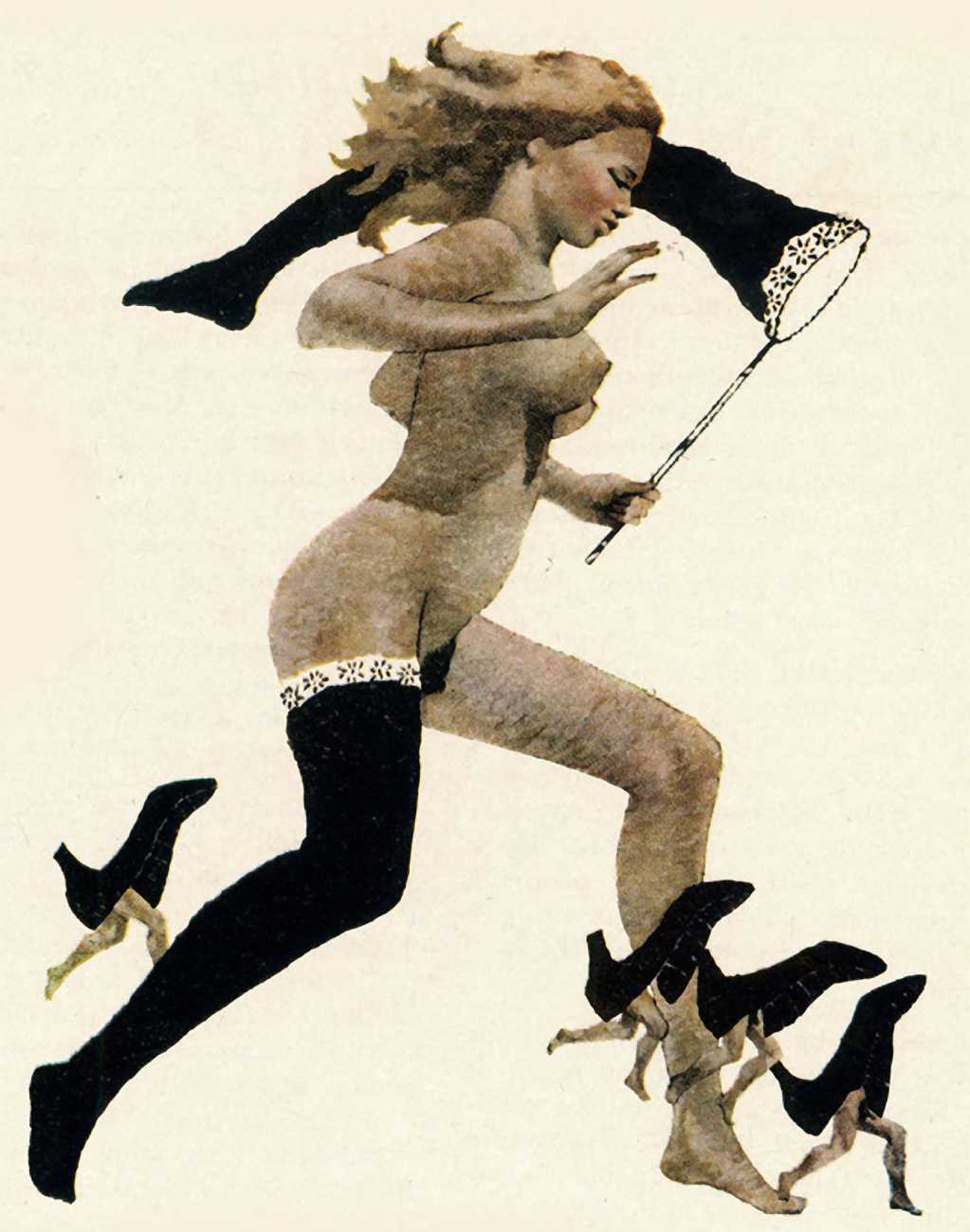
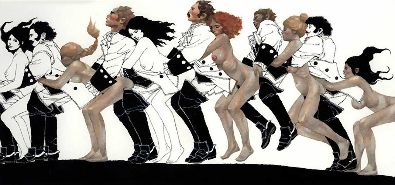
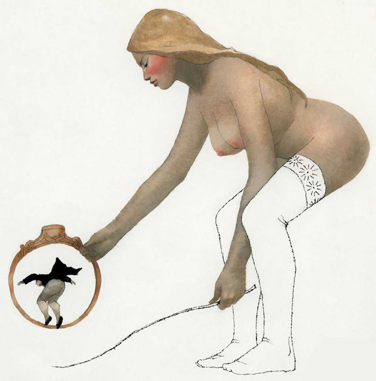
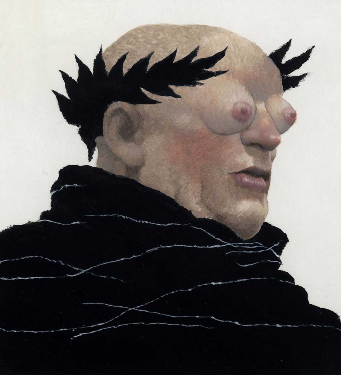
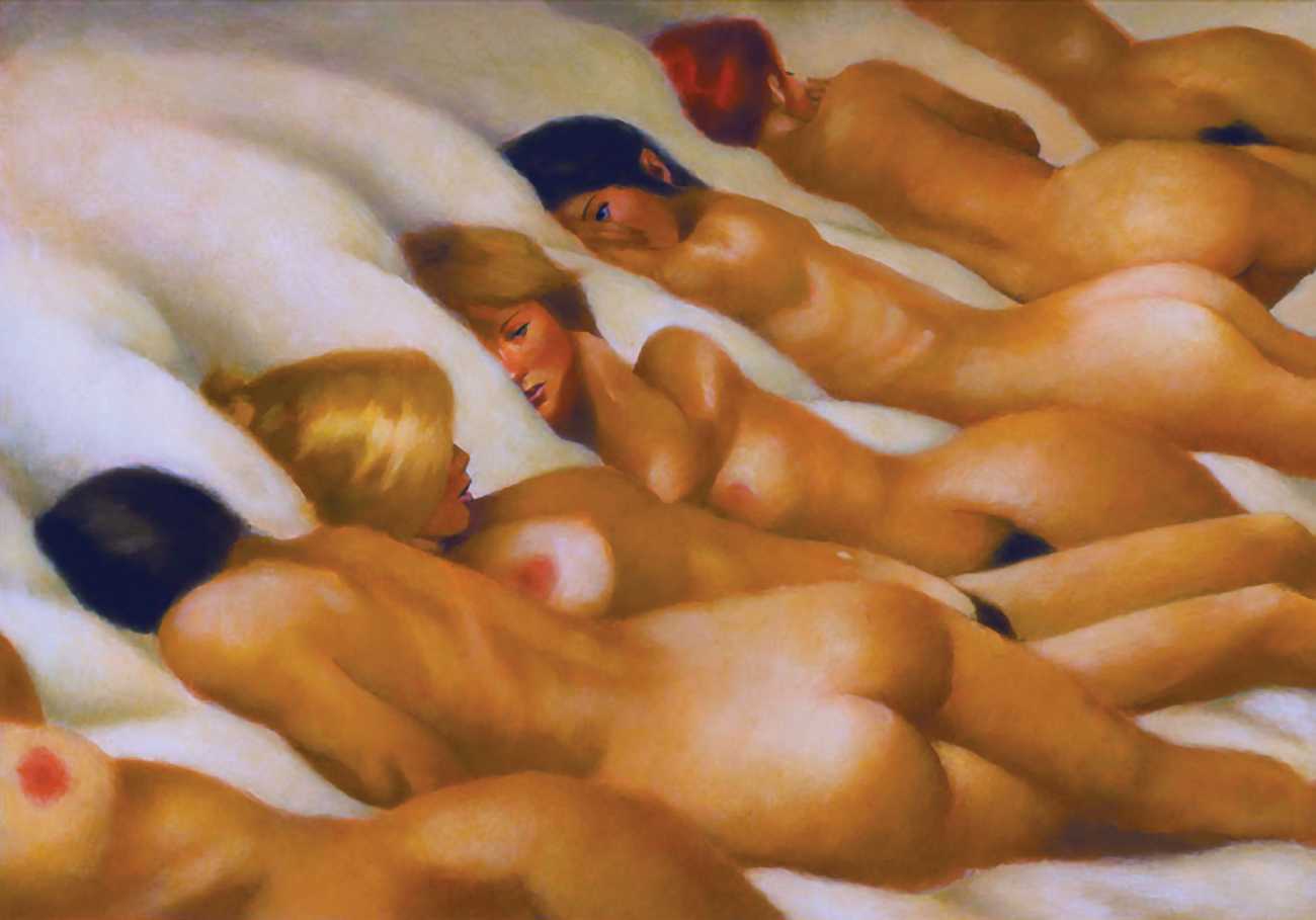
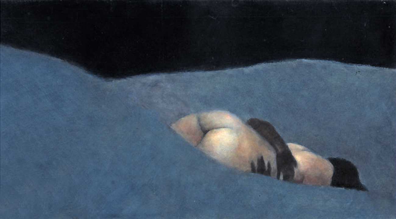
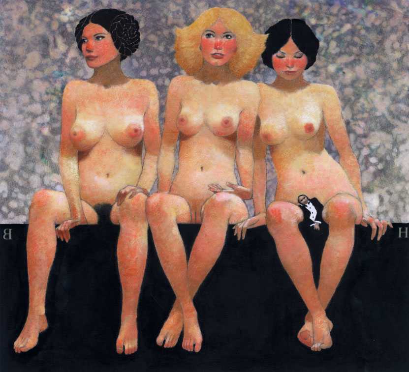
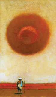
The brief the editors had given me for the series was simple enough: Illustrate the stories faithfully and make sure the period costumes were accurate. They seemed to think that since the tales were all taken from historical texts, the illustrations should somehow look like period pieces. I understood their reasoning and realised that it was a good editorial concept – except that it didn’t interest me. I was far more interested in drawing imaginative pictures than in doing historical research, and since the stories invariably involved sexual adventure and misadventure, I soon found that I could dispense with the costumes altogether, except as a graphic element, and concentrate on the figures, preferably naked ones. Drawing people without clothes solved one part of the conceptual problem – naked people can’t be dated to any particular historical period. That made it easier for readers to see the pictures as contemporary work rather than pieces dug out of an archive.
The next step was to get the editors to see the art as a companion to the text rather than an illustration. I knew that would be harder and would take longer. The editors had competing theories as to why they thought my illustrations didn’t illustrate. A common theme was that I must not have mastered the art of reading. Someone said they should boil down the stories for me to a simple paragraph or two, as if I were a second grader or a corporate executive. Others guessed that I just wasn’t clever enough to come up with ideas, or was merely sending in weird stuff to see what I could get away with. If it hadn't been for the art director’s confidence in me that first winter, I doubt that I would’ve lasted.
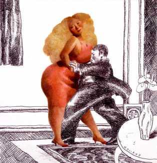 Our working arrangement always began when the art department sent me a layout based on the story’s word count. Whatever picture idea I came up with then would have to fit into the pre-determined space they had given me. Moreover, the figures I drew were often going to be naked. That meant that whatever colours I used would either be limited to skin tones or introduced as other elements. At first I tried to saturate the pictures with colour and draw over them with black line. That worked for a picture or two, but I realised that for an ongoing series there were limits to how many times I could get away with painting people blue and yellow.
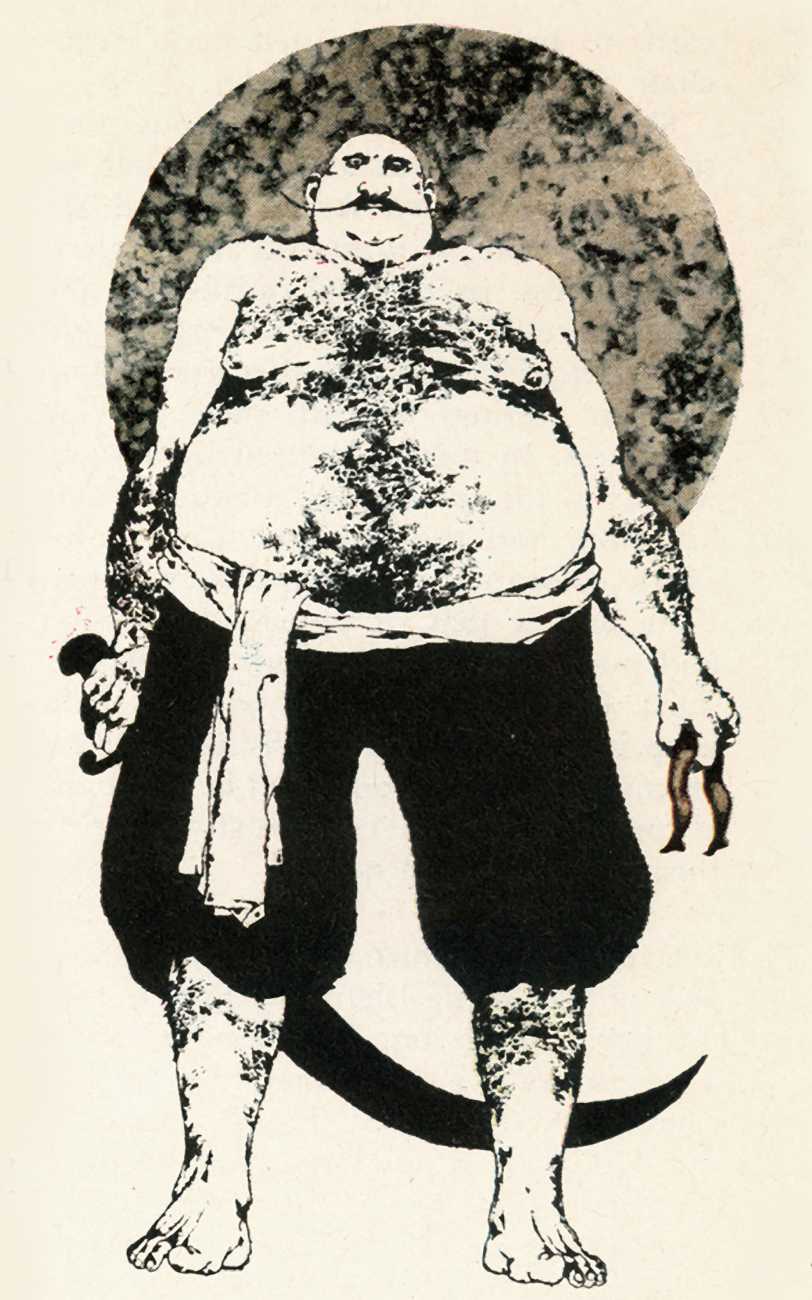
My original Ribald Classic style dated to my teenage years, and owed a large debt to a number of artists, most of them dead. It turned out there were several advantages to this, the chief one being that I was never likely to run into any of them at cocktail parties. But in general, my influences had been Ben Shahn’s drawings, Leonard Baskin’s prints, and the woodcuts of the great eighteenth century Japanese artist Hokusai. Yet what I made of these influences owed a good deal to my youth, ignorance and lack of education.
I had never taken an art course since the ninth grade in high school. In the long run, that turned out to be a blessing in disguise, but at the time, when I was first floundering around in Chicago, it seemed to be a blessing that had been very well disguised. Many of the artists I admired were printmakers, yet at eighteen I didn’t really understand that. Of course I knew vaguely what a woodcut was, but at that age I couldn’t have told you how one differed from a wood engraving. As for lithographs, I mistook the texture of the limestone blocks for the effects of charcoal, crayons or pastels. And etchings I believed to be plain ink drawings and I marvelled at how anyone could achieve the subtle background tones that were actually the ghostly residual tone of ink wiped off the surface of the etching plate. So my Ribald Classic style evolved from trying to get the effects of woodcuts, lithographs and etchings without knowing at the time that it was the printmaking process itself that yielded those effects. As a result, I experimented with direct ways of getting textures and succeeded in getting something original.
Looking back, what strikes me now is how far out of the mainstream it all was. At the time Pop Art and the Mod look were in fashion. Illustration was being influenced by that. I seemed to be going in a different direction. Meanwhile the editors at Playboy who had originally expected period pieces out of me began to get used to getting something else.
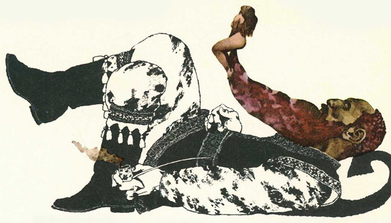
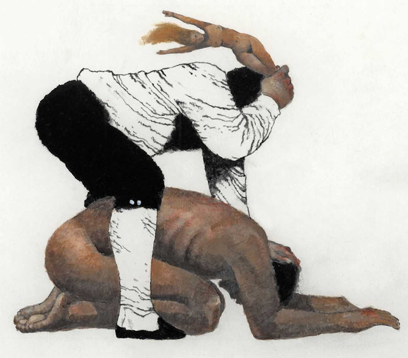
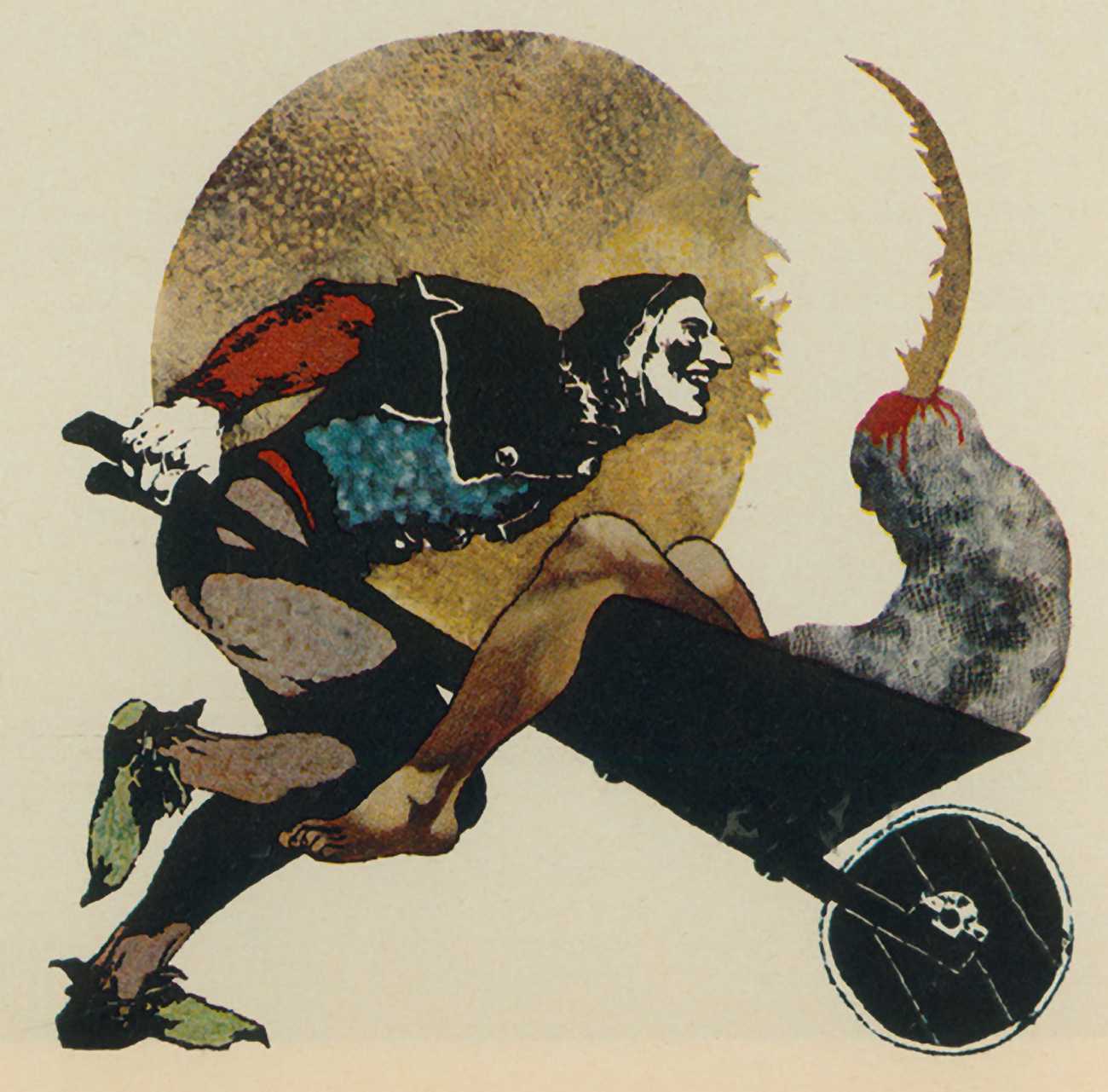
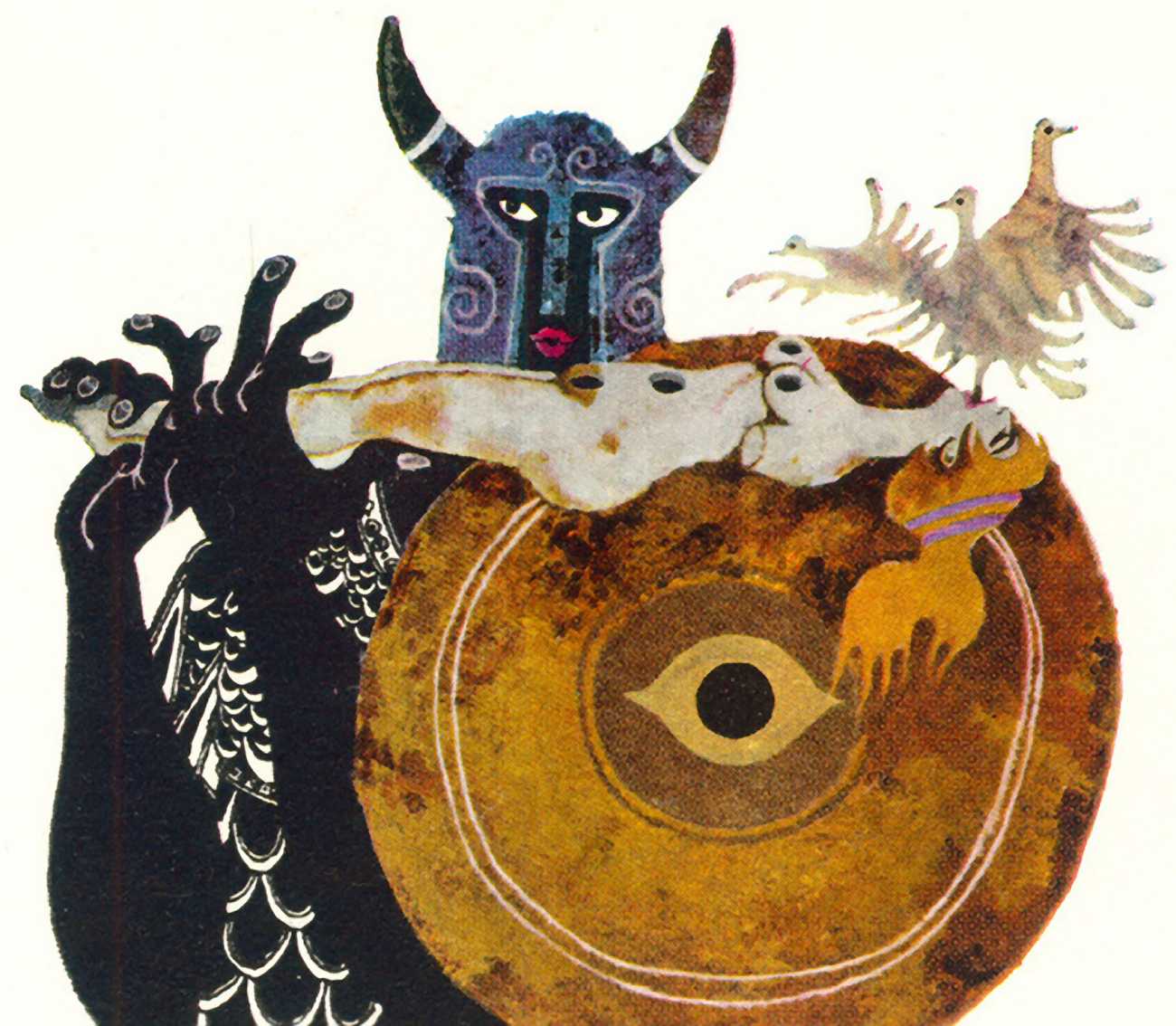
The limitations of the page led me to another innovation that, for a while, baffled the editors. In order to compress ideas into a limited space, I began using figures of differing sizes. Setting big figures against little ones became one of the trademarks of the Ribald Classic pictures; in fact I believe it was through this series that the use of disparately sized characters entered modern graphic art. With the exception of Heinrich Kley’s sketchbook drawings, done in Germany in the 1920s, I’m unaware of the device being used anywhere before this. As useful as the innovation came to be, it was certainly one that disturbed editors at the time. ‘Tell him he isn't illustrating Gulliver’s Travels’, one editor at Playboy told the art department.
As inconceivable as it might seem these days, in all the years I worked on the Ribald Classics I never had to send in a single sketch for approval. A week – or sometimes just a few days – before the final art was due, I’d get a layout from Bob Post, the Assistant Art Director. Then, on the day it was due, Bob would get the art from me. Year after year, from the very beginning, nobody at the magazine ever knew what I was going to send them until they got it.
It was my good fortune to stumble into the magazine at just the right time, when its reach was the greatest and its reputation the highest, but while its founding art director was still in charge and willing to let even a young artist with more imagination than good sense experiment with both style and content. The platform Art Paul provided at Playboy is a testament to how decisive one art director’s vision can be, not only in defining the look of the time, but in exposing to the world the talents of artists who have something unique to say.